********************
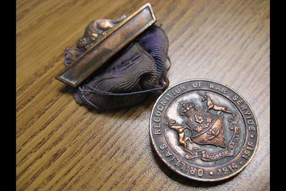
The medal named the Orillia’s Recognition of War Service was issued to those who served in what was then known as The Great War 1914-1919.
Canadians, including hundreds of Orillians, had remained in service in Europe after the cessation of hostilities on Nov 11, 1918, hence the reference to 1919. To my mind, this medal was the most heartfelt expression of gratitude this municipality has ever bestowed.
On the back of this memorial to these soldiers’ military service was the coat of arms of the Town of Orillia as was designed by Mayor William S. Frost in 1912.
Although later iterations of that crest deflected from Mayor Frost’s unadorned design elements of the twin stags, the ribbon with the civic moniker of Progress Orillia, the honoured design figures of the crown, and the sprig with three maple leaves. Of special note was the Indigenous canoeist.
It would stand to reason that Mayor Frost borrowed design elements from the coat of arms of the Province of Ontario, as was adopted only three years prior in 1909. Instead of Orillia having two stags supporting the shield, Ontario has one stag and one moose. Both coat of arms features the three maple leaves.
At a quick glance, these similar coats of arms could be misidentified. The top of the original Orillia design however has the crown, whereas Ontario has a bear.
On closer look, whereas Orillia’s shield element features the Indigenous canoeist, the Province’s shield instead identifies its’ Anglo-Saxon origins through the St. Georges’ cross.
The sole change that I was respectful of the redesign of 20 years ago was the rightful inclusion of the fishing weirs.
Regrettably, the blue antlers, the collars and medallions worn by the stags, the grass, flowers, and (what I assume to be) a face shield from a suit of armour wrapped in laurel, have collectively dominated the design such that it has taken two decades for the colour palette to become a topic of discussion.
Through this letter I seek to respectfully offer insights to the original design by Mayor Frost.
The Council of 1912 had some of Orillia’s historical heavyweights: Frost, Hale, Tudhope, Long, Church, Curran… These are surnames recognizable even over a century onwards.
They could have adorned the crest with self-promoting symbols for which the town was better known, such as industry, hydroelectricity, sports, or imagery related to either Champlain or Leacock.
It was that Council from 1912 that first planned for a 300th anniversary commemoration of the French explorer. That was also the year the author from Brewery Bay wrote the best-selling novel Sunshine Sketches of a Little Town as set in the locale of his adopted summer home.
Given the time, and given the parties deciding upon our municipal coat of arms, I remain highly appreciative of the choice by Frost to make the Indigenous paddler emblematic of Orillia.
Before potentially opening another rabbit hole for historical reinterpretations, I hope that Council will seek to appreciate the core elements of the original design by Mayor Frost. If recolouring the current coat of arms is called for, then so be it.
Bruce McRae
Orillia
********************


